Subtleties of Color (Part 2 of 6)
August 6th, 2013 by Robert Simmon The “Perfect” Palette
Despite the near-ubiquity of the rainbow palette—which distorts patterns in the underlying data—the basics of using color to represent numerical data are well-established.
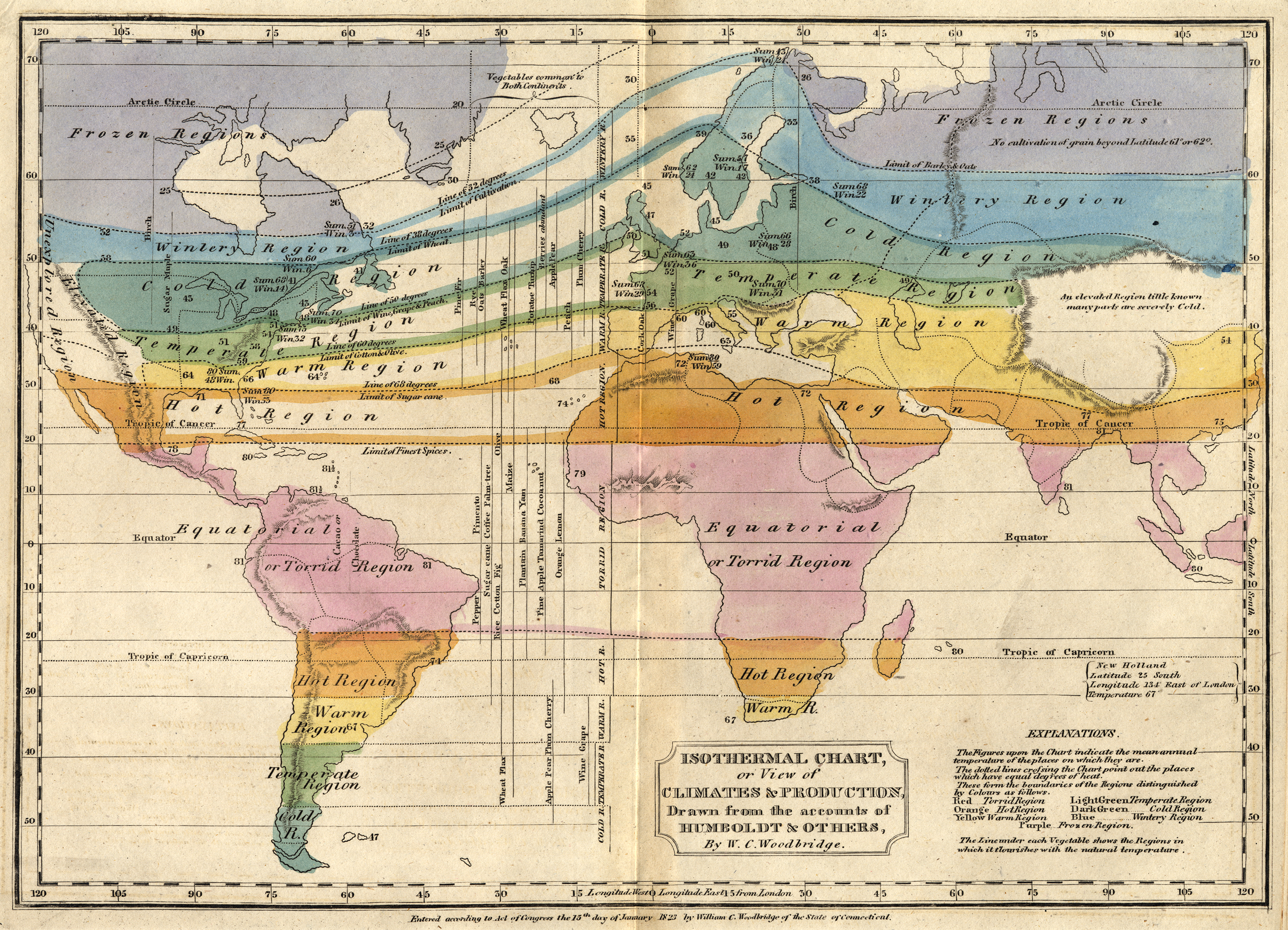
 This
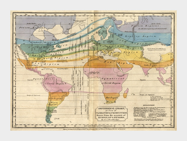
1823 map by W. C. Woodbridge is an early example of the use of colors
to represent numbers—in this case more qualitative than quantitative.
The rainbow palette is effective for this map because colors in the
spectrum are perceived as “cool” and “warm,” and the colors clearly
segment the climate zones. Map from the Historic Maps Collection, Princeton University Library.
This
1823 map by W. C. Woodbridge is an early example of the use of colors
to represent numbers—in this case more qualitative than quantitative.
The rainbow palette is effective for this map because colors in the
spectrum are perceived as “cool” and “warm,” and the colors clearly
segment the climate zones. Map from the Historic Maps Collection, Princeton University Library.
By the mid-1960s cartographers had already established guidelines for
the appropriate use of color in map-making. Jacques Bertin pointed out
shortcomings of the rainbow palette in Sémiologie Graphique (The Semiology of Graphics),
and Eduard Imhof was crafting harmonious color gradients for use in
topographic maps [published in Kartographische Geländedarsellung (Cartographic Relief Presentation)].
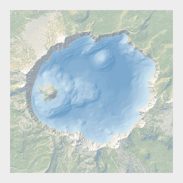 The subtle colors in this bathymetric map of Crater Lake are a direct descendent of the palettes created by Eduard Imhof. Map courtesy National Park Service Harper’s Ferry Center.
In the 1980s and 1990s researchers in perception and visualization
were investigating the efficacy of palettes, based on the ways our
brains and eyes physically respond to light. These color scales were
crafted to achieve the principal goals of spatial displays: to show
patterns and relationships in data, and to allow a viewer to accurately
read individual values. [Colin Ware (1988) Color Sequences for Univariate Maps: Theory, Experiments, and Principles; Brewer (1994) Color Use Guidelines for Mapping and Visualization; Rogowitz and Treinish (1995) How NOT to Lie with Visualization; Tufte (1997) Visual Explanations; Spence et al. (1999) Using Color to Code Quantity in Spatial Displays.]
According to much of this research, a color scale should vary
consistently across the entire range of values, so that each step is
equivalent, regardless of its position on the scale. In other words, the
difference between 1 and 2 should be perceived the same as the
difference between 11 and 12, or 101 and 102, preserving patterns and
relationships in the data. (For data with a wide range that is better
displayed logarithmically, relative proportions should be maintained:
the perceived difference between 1 and 10 should be the same as 1,000
and 10,000.) Consistent relationships between numbers—like in a
grayscale palette—preserves the form of the data. Palettes with abrupt
or uneven shifts can exaggerate contrast in some areas, and hide it
others.
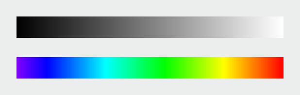 Compared
to a monochromatic or grayscale palette the rainbow palette (IDL
number 35) tends to accentuate contrast in the bright cyan and yellow
regions, but blends together through a wide range of greens.
Compared
to a monochromatic or grayscale palette the rainbow palette (IDL
number 35) tends to accentuate contrast in the bright cyan and yellow
regions, but blends together through a wide range of greens.
A palette should also minimize errors from the color shifts
introduced by nearby areas of differing color or lightness, a
phenomenon known as simultaneous contrast.
 Simultaneous
contrast (a visual phenomenon that helps us interpret shapes through
variations in brightness) shifts the appearance of colors and shades
based on their surroundings. (After Ware (1988).)
Simultaneous
contrast (a visual phenomenon that helps us interpret shapes through
variations in brightness) shifts the appearance of colors and shades
based on their surroundings. (After Ware (1988).)
Simultaneous contrast is most pronounced in monochromatic palettes,
while sharp variations in hue minimize the effect. As a result
variations of the rainbow palette are good for preserving exact
quantities.
How to take advantage of the strengths of both the grayscale palette
(preservation of form) and rainbow palette (preservation of quantity),
while minimizing their weaknesses? Combine a linear, proportional
change in lightness with a simultaneous change in hue and saturation.
Colin Ware describes this type of palette as “a kind of spiral in color
space that cycles through a variety of hues while continuously
increasing in lightness” (Information Visualization: Perception for Design,
Second Edition). The continuous, smooth increase in lightness
preserves patterns, the shift in hue aids reading of exact quantities,
and the change in saturation enhances contrast.
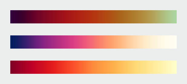 A
color palette that combines a continuous increase in lightness with a
shift in hue is a good compromise that preserves both form and
quantity. These three palettes show the smooth, even gradations that
result from color scales calculated in perceptual color spaces. Color
scales with varied hues and contrast are suitable for representing
different datasets. (After Spence et al. (1999), chroma.js, and Color Brewer.)
A
color palette that combines a continuous increase in lightness with a
shift in hue is a good compromise that preserves both form and
quantity. These three palettes show the smooth, even gradations that
result from color scales calculated in perceptual color spaces. Color
scales with varied hues and contrast are suitable for representing
different datasets. (After Spence et al. (1999), chroma.js, and Color Brewer.)
Of the three components of color—hue, saturation, and lightness—lightness is the strongest.
As a result, accurate, one-way changes in lightness are more important
than those in hue or saturation. For example, a color scale that goes
from black to color to white can still be read accurately, even though
the saturation is lower at both ends of the scale than in the middle.
This allows a bit of flexibility in designing palettes, especially for
datasets that benefit from high-contrast color ramps. You also don’t
need to worry too much about color scales that drift a little bit out
of gamut (the complete range of colors displayed on a particular
device) for a portion of the ramp. Just make sure lightness is still
changing smoothly.
 This
palette differs from the ideal with saturation that increases from
low-to-mid values, and decreases from mid-to-high values. It’s still
readable because lightness, the component of color perceived most
strongly, changes continuously. (Derived with the NASA Ames color
tool).
This
palette differs from the ideal with saturation that increases from
low-to-mid values, and decreases from mid-to-high values. It’s still
readable because lightness, the component of color perceived most
strongly, changes continuously. (Derived with the NASA Ames color
tool).
All of these palettes are appropriate for sequential
data. Data that varies continuously from a high to low value; such as
temperature, elevation, or income. Different palettes are suited to
other types of data, such as divergent and qualitative, which I’ll
discuss next week.
Subtleties of Color
Part 1: Introduction
(This series on the use of color in data visualization is being cross-posted on visual.ly. Thanks to Drew Skau at visual.ly for the invitation.)
NASA: Subtleties of Color (Part 2 of 6) by Robert Simmon - The “Perfect” Palette - 08.08.13
Ricardo M Marcenaro - Facebook
Blogs of The Solitary Dog:
solitary dog sculptor:
http://byricardomarcenaro.blogspot.com
Solitary Dog Sculptor I:
http://byricardomarcenaroi.blogspot.com
Para:
comunicarse conmigo,
enviar materiales para publicar,
propuestas:
marcenaroescultor@gmail.com
For:
contact me,
submit materials for publication,
proposals:
marcenaroescultor@gmail.com
My blogs are an open house to all cultures, religions and countries. Be a follower if you like it, with this action you are building a new culture of tolerance, open mind and heart for peace, love and human respect.
Thanks :)
Mis blogs son una casa abierta a todas las culturas, religiones y países. Se un seguidor si quieres, con esta acción usted está construyendo una nueva cultura de la tolerancia, la mente y el corazón abiertos para la paz, el amor y el respeto humano.
Gracias :)

No hay comentarios:
Publicar un comentario